Farin Sadiq

Farin Sadiq

Farin Sadiq

Farin Sadiq

Responsive Web design

VeloLife

Responsible:

Project management
UX Design

Team

Jonathan Woods, Product Owner
Wasiq Sharefi, UI Designer
Madina, Web Developer

Live website

Project overview

VeloLife is a supplier of bike insurance and related services. They experienced a drop in sales and leads and decided to create a new, user-centric experience for website visitors, with a primary focus on bike insurance and additional services for life and health insurance.
This project’s goal was to fix major flaws with their outdated landing page design and create a new user experience that would effectively attract and engage their target audience.

Problem statement

The previous landing page received minimal user engagement and had a high bounce rate. It was busy, complicated, and unattractive to users. A user-centric design was clearly necessary.

Previous design

Research

Pain points

1.Accessbility first

Users found the quote request form design not accessable, confusing and distracting.

2.Unclear CTAs

Unclear call-to-action buttons left users confused about their next steps.

3. Poor information architecture

Vital bike insurance features were hidden behind a tiny, easily overlooked button.

4. Inconsistency in design

Visual brand inconsistency detracted from the site’s overall appeal and user experience

5. Unclear user journey

Users grappled with service ambiguity stemming from multiple offerings and unclear call-to-action buttons.

Design solutions

1. Simplify the landing page layout and content to streamline the user journey and minimize confusion

2. Redesign Get a Quote form and move separate page to eliminate confusion and make it prominent

3. Strategically placing CTA buttons

4. After ensuring that users have a clear understanding of the offered services, we will reposition the customer feedback section to reinforce trust and benefits.

5. Ensuring visual consistency and align Color palette and visual element

Wireframes

Design iteration

Once the initial design was presented to the client, it was crucial to gather feedback and insights. The collaborative process is integral to crafting a user experience that aligns perfectly with the client’s vision and the end-users’ needs. The following insights were gathered:

1. Make a Claim” to navbar and added Quick Quote to decrease the interaction cost

2.Restructured the layout to balance content and visual elements while aligning columns using a grid system

3. Adjusted the layout to emphasize the primary service, enabling users to distinguish main services from additional offerings

4. Refined the visual presentation of the testimonials section to enhance visibility and user interaction

Final product

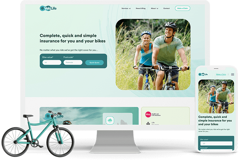
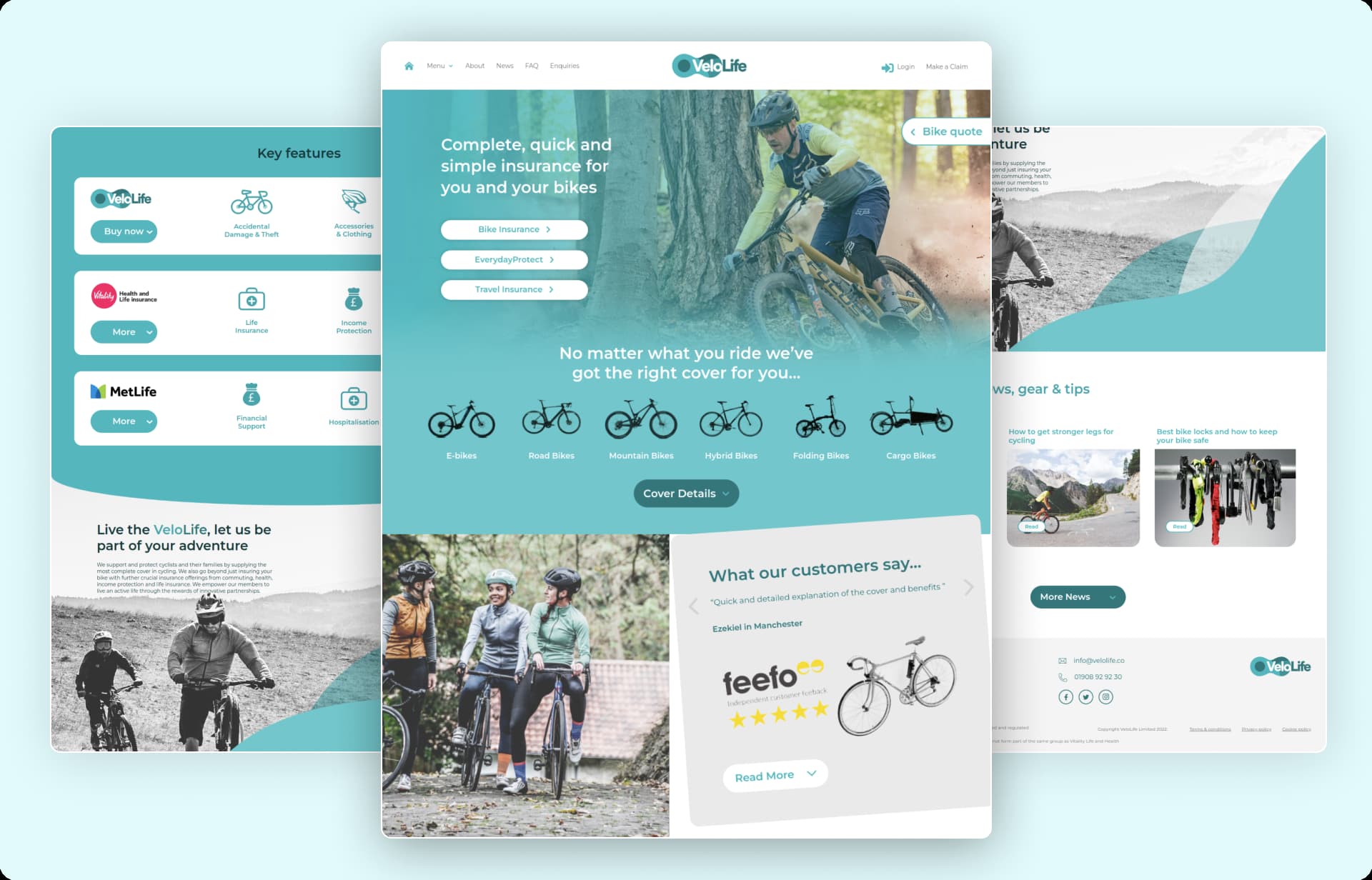
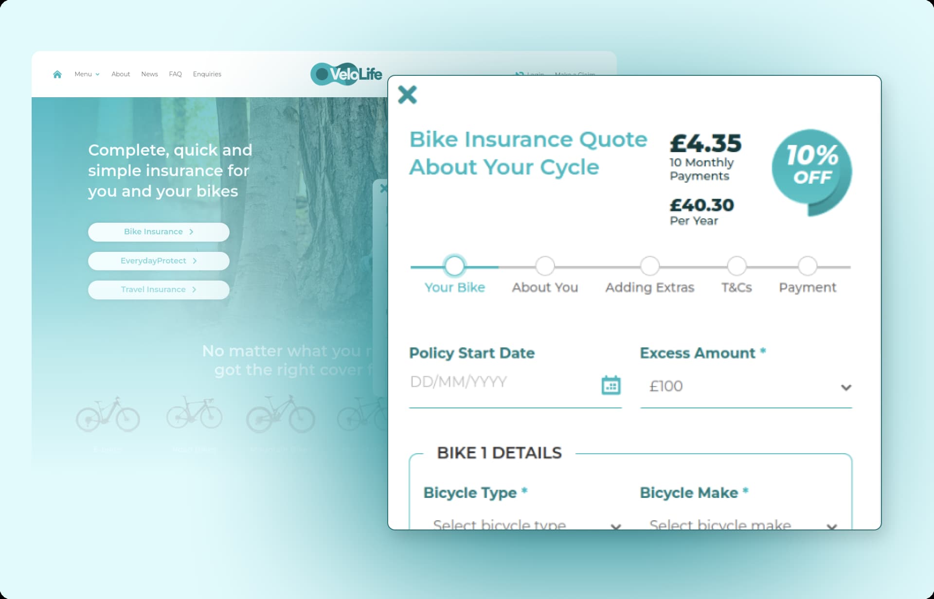
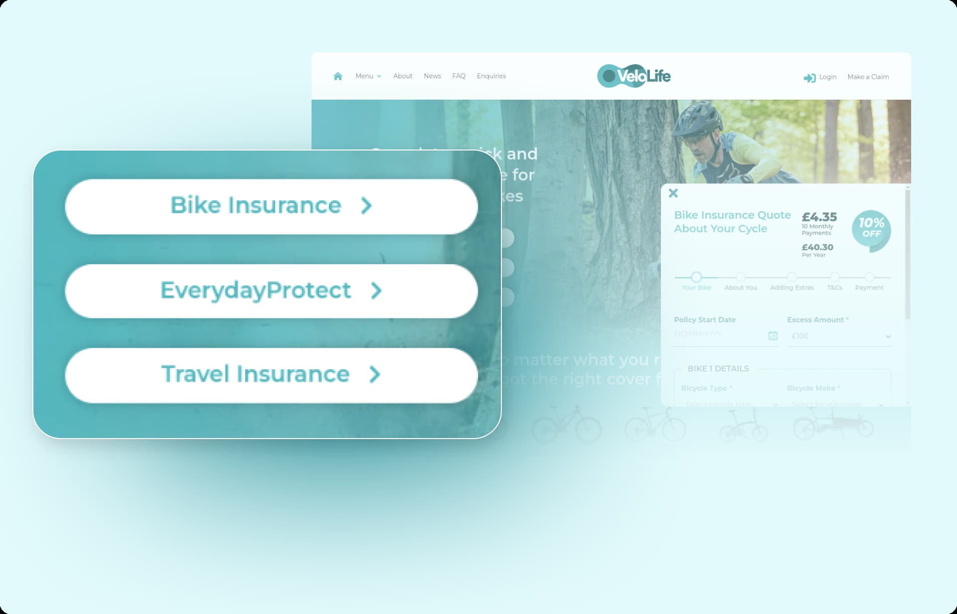
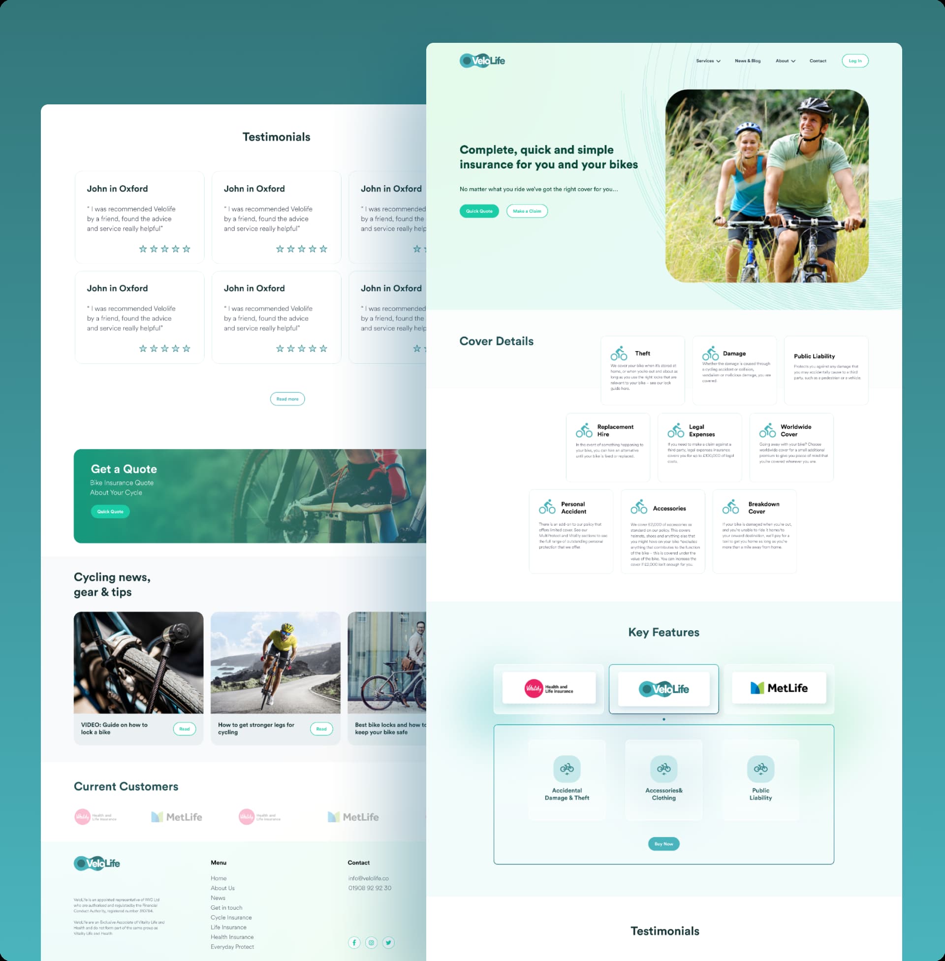
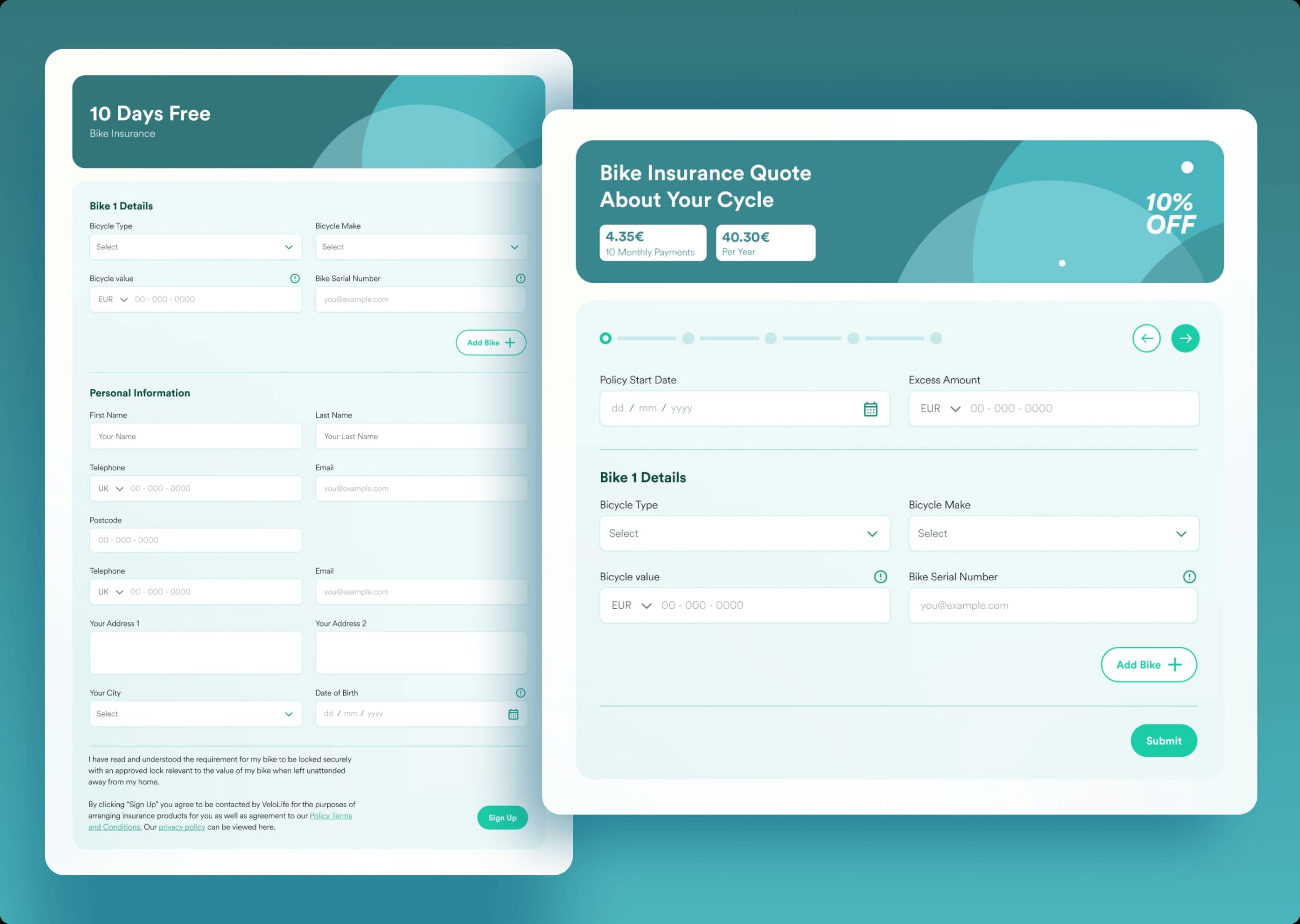
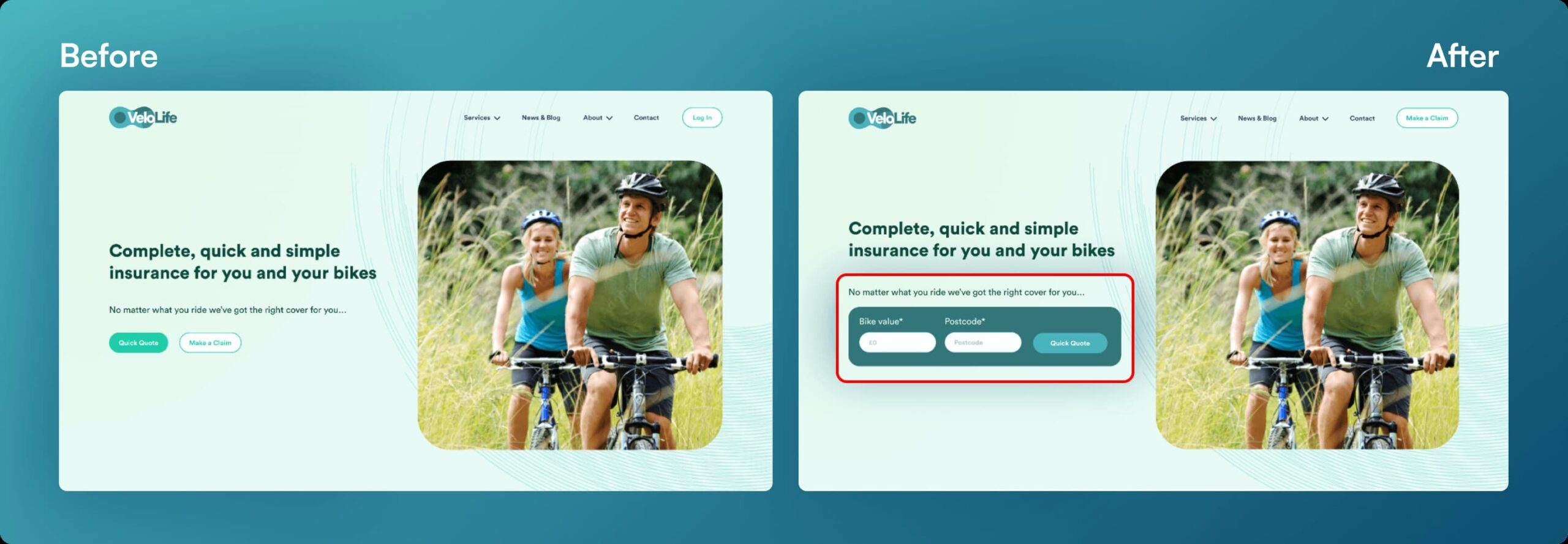
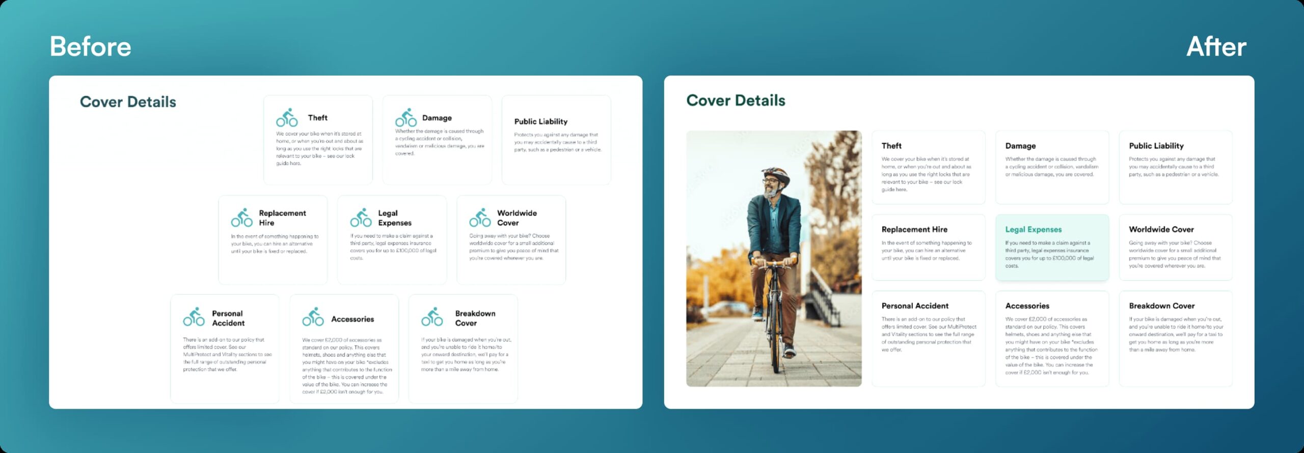
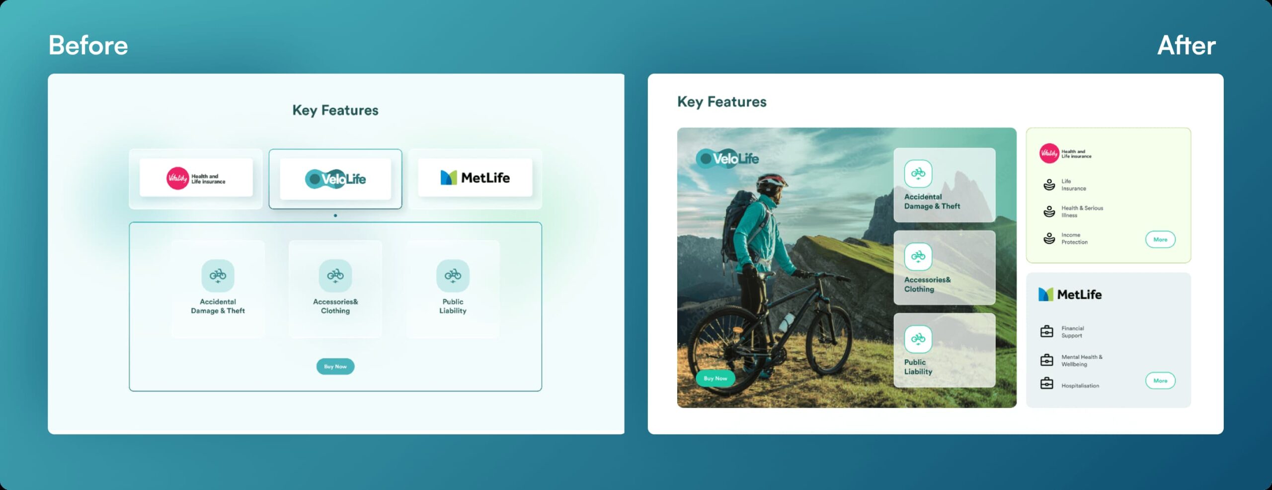
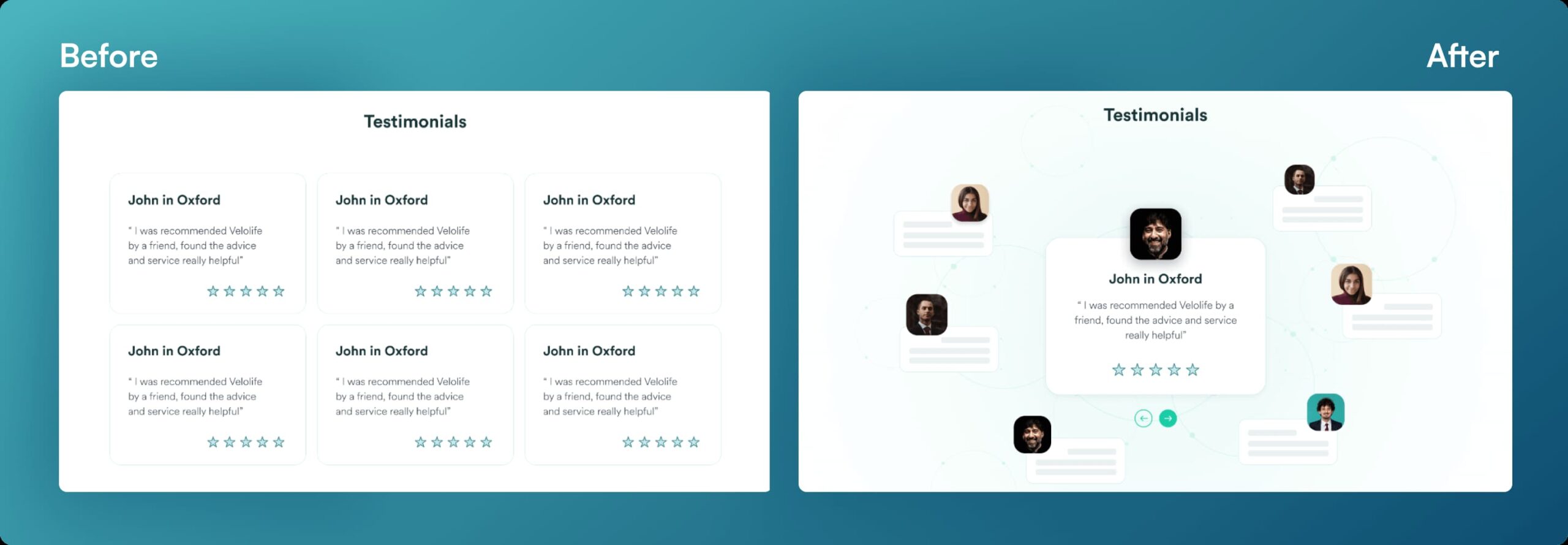
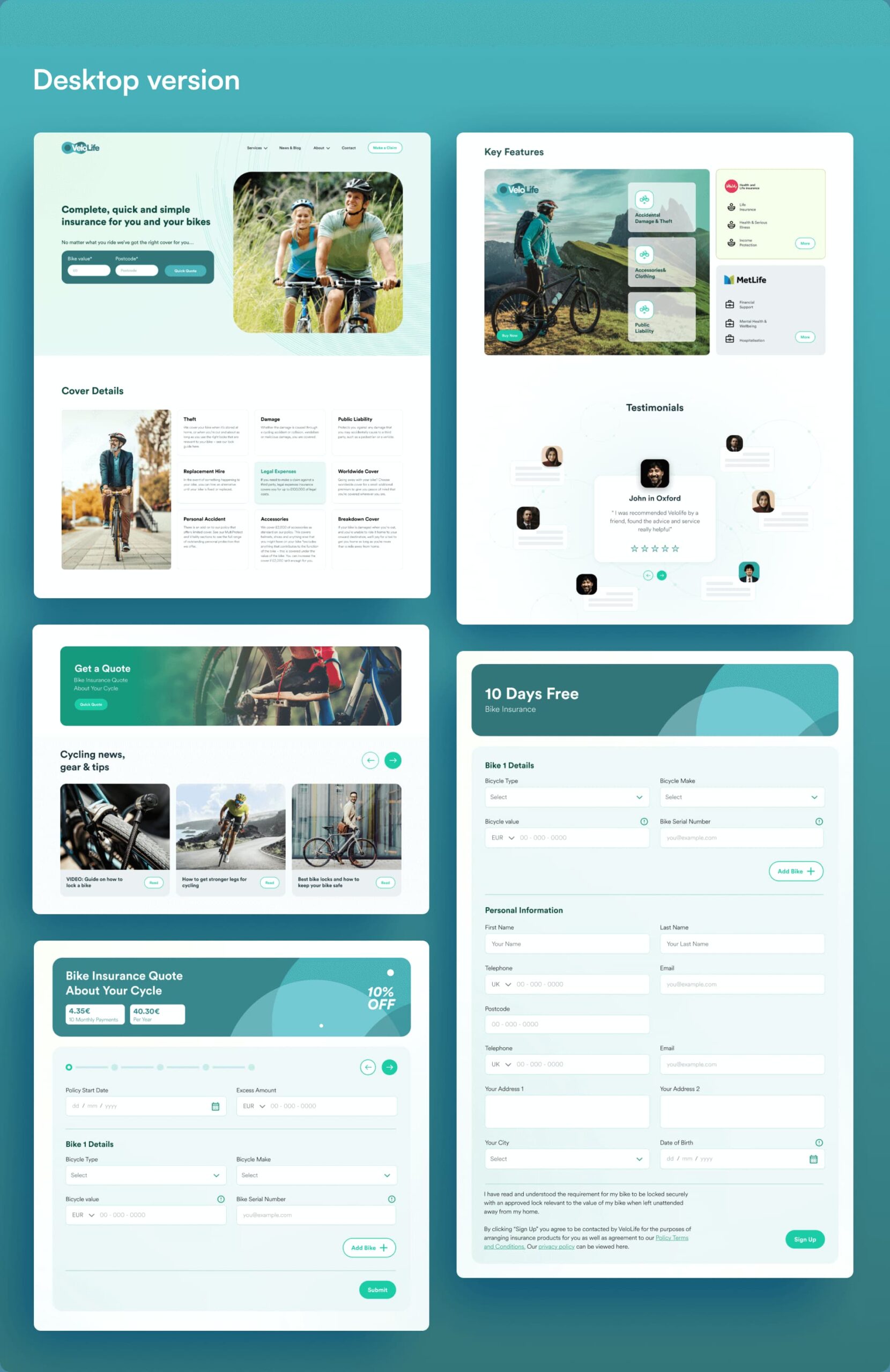
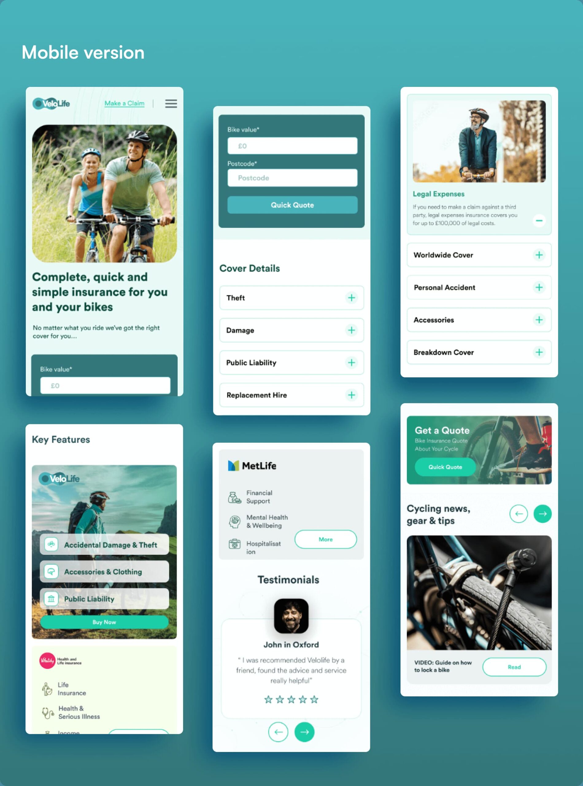
Our solutions have transformed VeloLife’s website into a user-centric platform. Users now navigate the site effortlessly, understanding their insurance options, and completing quote requests. Conversion rates have soared, and visual consistency has enhanced brand alignment. The website is now an engaging and trustworthy gateway for bike insurance, boosting VeloLife’s success in the industry. In this journey, we demonstrated the power of user-centric design in enhancing website performance, maximizing user engagement, and increasing conversion rates. With these improvements, VeloLife is poised for further growth in the highly competitive insurance

Next project

Next project

Zamanat